Install the app
How to install the app on iOS
Follow along with the video below to see how to install our site as a web app on your home screen.

Note: This feature currently requires accessing the site using the built-in Safari browser.
You are using an out of date browser. It may not display this or other websites correctly.
You should upgrade or use an alternative browser.
You should upgrade or use an alternative browser.
Graphic Showroom
- Thread starter Waffle
- Start date


Exfoliate
Geek Trainee
Kick ass award right there! Exile is particularly sweet, got to love those layer masks eh? And just looking at the prince reminds me how much I want to get The Two Thrones when it comes out. EXCELLENT work man, the only thing I'd change is the fonts perhaps and maybe take out those little studds bordering the Prince. Very minor, I just love 'em.
Speaking of awesome I've been meaning to congratulate you Matt on you're crazily cool sig. You've taken tech to the next level with this one, great symetry and design. Lovin it!
Speaking of awesome I've been meaning to congratulate you Matt on you're crazily cool sig. You've taken tech to the next level with this one, great symetry and design. Lovin it!


InsaneSharpie
Geek Trainee
Well i got some peices of art i would like to share


zeus
out of date
I didnt know this thread existed...
I havent done any of these for some time now. I keep starting something but never finish. Im waiting on the program to be updated, not long now.
I havent done any of these for some time now. I keep starting something but never finish. Im waiting on the program to be updated, not long now.
Attachments


InsaneSharpie
Geek Trainee
Thank you
Big B
HWF Godfather
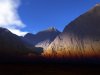
Here's links to a few wallpapers I made a few years ago...


This last one might not be entirely work safe, FYI.
http://img.photobucket.com/albums/v205/bigbman/wallpaper/lastshreadofdignity.jpg
These are shrunk down from their original sizes...
This last one might not be entirely work safe, FYI.
http://img.photobucket.com/albums/v205/bigbman/wallpaper/lastshreadofdignity.jpg
These are shrunk down from their original sizes...